Who We Are

The Inspiration Behind Our Logo

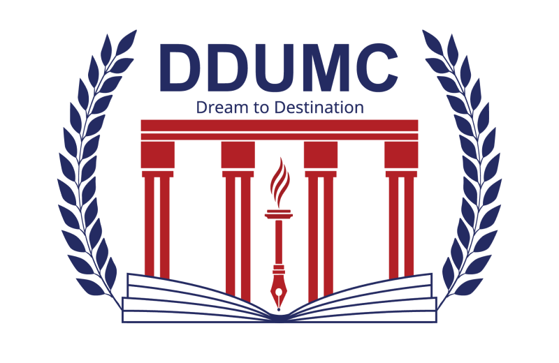
The philosophy of DDUMC’s logo is to reach out across the country. Here in our logo, every element speaks something and represents a touch for everyone.

Dream to Destination is not just a slogan of DDUMC, it’s our aim to provide the right avenue for the millions of aspirants on their career paths. It signifies that you have the right avenue to transform dreams into reality.

1
Why the Colours Blue & Red Logo

Why the Colours Blue & Red:

The design of the DDUMC logo is rendered in red and blue. The colour red is associated with power, energy, strength, desire, purpose, and passion, while the colour blue is a soothing color that signifies faith, trust, devotion, wisdom, and honesty.

2
Four Pillars

Four Pillars

We are inspired by our heritage building, which has a base of four pillars. These four pillars represent the four components and support our students from four directions. These pillars point toward learning to know, learning to do, learning to be, and learning to live together forever.

3
A Torch Logo

A Torch

A torch represents the bright shine, gives our students endurance, and inspires them to shine like stars. From bottom to top.

4
A Pen Logo

A Pen Logo

Pens have a rich antique legacy & are not just a tool. It's a symbol of the enduring journey toward excellence and a future shaped with purpose.

5
An Open Book Logo

An Open Book

An open book in our logo is specifically associated with wisdom and intellectual curiosity and represents the knowledge being freely shared & accessible.

6
The Leaves Logo

The Leaves

The leaves of the laurel wreath represent prosperity, wealth, and victory.